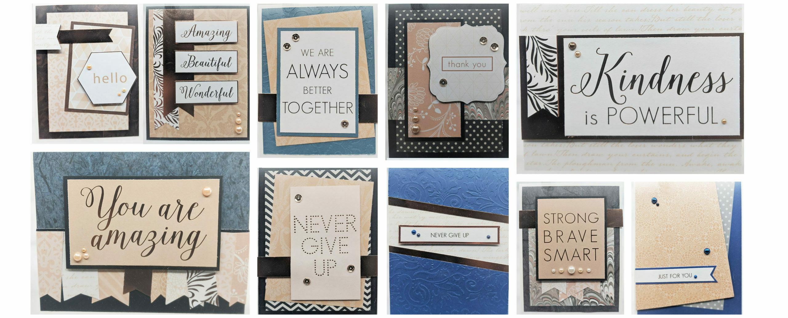
In my research on what monthly subscription card kit to invest in (post 1 and post 2), I made my own card kit using a 12 x 12 pattern paper pad I already have. The exercise was mainly to learn whether I would enjoy using pattern paper since I haven’t really used it much in my card making. My first set of cards (which you can see in my post or card gallery), I just thought were OK, so I wanted to try again this time using card layouts.
My first attempt, I more or less just “winged” it. But in my most recent attempt, I actually tried to find card layouts that closely matched the original cards I made in “round 1”. I highly advise using card layouts if you aren’t accustomed to layering and using pattern paper. By having a layout, you reduce one of many design decisions. There’s still the challenge of choosing the right combination of patterns/colors but at least you’ve got one decision nailed down and then can focus on pattern matching.
Below are some side-by-side of round 1 vs round 2 cards. Keep in mind, since I was just playing around in round 1, sometimes I couldn’t easily find a similar card layout. Also, I was also using up old scrapbooking paper I had, so by round 2, some of that was in short supply, so I couldn’t replicate some of the original cards in round 1.
Round 1 Cards

Round 2 Cards

I actually think the version from Round 1 looks nice. But I have to admit the Round 2 version does feel more balanced in some ways. If I wasn’t strictly working with cut-outs from the paper pad, a bolder sentiment would have been nice on the right, but all-in-all, I think they both have their charm.


If there was a contest for most improved it might be this one. I don’t much like the first attempt. It’s actually my least favorite of the bunch. Could just be me. However, when I tried to find similar layouts with that angular paper placement, all of the examples I found had the negative space on the bottom. I wonder if that’s because we read left to right, top to bottom, so leaving that space “empty” feels more natural?


This is another one where the one from Round 1 was OK but not great. What an improvement to actually go by a real card layout! It’s such a cleaner design with each element having its place. Thank goodness for card layout designers!


Again, another one where Round 1 wasn’t too shabby. However, when I looked up layouts, most had the accent band at the top. I think the one from Round 2 is more cohesive. The first one feels like a lot of different parts put together that don’t quite make up a whole design. I do like the layering of the central focal element on the left, but everything else feels haphazard.


This is another case of a lot of different elements that aren’t really coming together. However, the Round 2 version is nice and clean. It definitely feels more pleasing to the eyes.


This is another case where I didn’t hate the one from round 1, but wow does it make a difference to use a card layout. I also think it celebrates the pattern paper more.


The Round 2 card is one of my favorites. The photo makes it hard to appreciate the mirror foil paper, but it’s really very nice. And the background paper with the scripty words is also part of the paper pad. So again, I think this is a better celebration of the pattern paper because it’s both the background and the focal design.


This one might be a bit of a toss up. I do think the second one accentuates the pattern paper more. It’s hardly used much on the Round 1 card except for the two sentiment cutouts. In that way, the one from Round 2 is better for actually highlighting the paper pad.
More Cards From Round 2
I had so much fun; I just kept going!


I haven’t even used up half of my 12×12 paper pad. I do have to note that this Rose Quartz paper is actually fairly thick — I would say it’s lightweight cardstock. It’s a great layering weight and not flimsy at all. Such great material to work with. I have loads more too! I think I might have used perhaps 20-30% of my supply.
What I’ve Learned
If there’s one lesson I’ve taken away — it’s to use the resources available to improve my own design eye. It’s hard to know how to improve your own design. But when you set about to remake your card, that’s when you learn. Card layouts and design inspiration from other makers on Instagram and Pinterest are fantastic resources. I think it’s important to dive in and play just to flex your own creativity. However, it’s useful to also use tried and true designs to learn from.

